


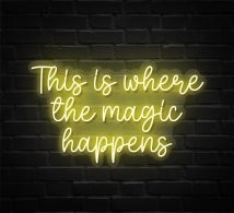
Thanksgiving brings warmth, togetherness, and festive cheer, and nothing expresses that mood better than a neon sign in full glow. A neon sign catches the eye, but the font captures the heart. Neon signs are far more than just bright lights, they turn everyday messages into striking, visually captivating displays that encourage people to pause and connect with your content. Yet there’s more to these signs than their radiant glow. The font you pick defines its personality, giving your message the ability to feel warm and inviting, bold and assertive, or sophisticated and refined.
In this blog, we’ll talk about how selecting the right neon fonts for thanksgiving promotions can shape the way customers experience your brand and connect with it.
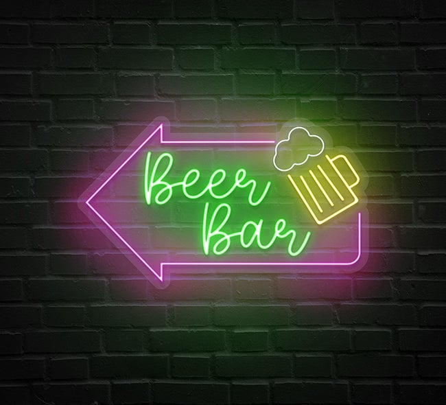
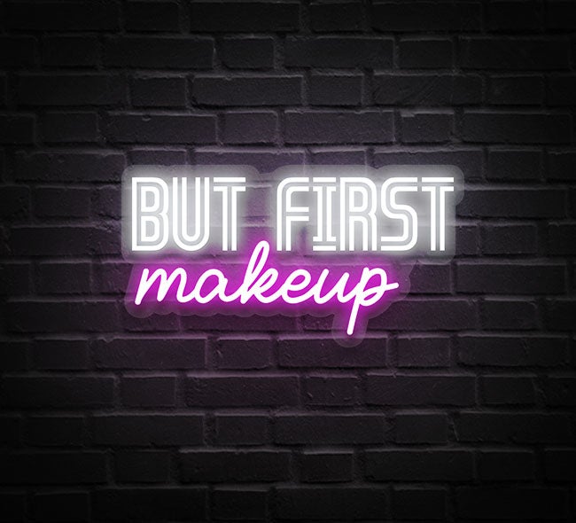
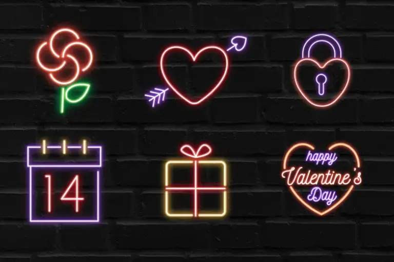
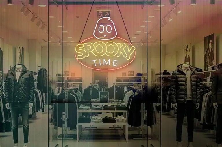
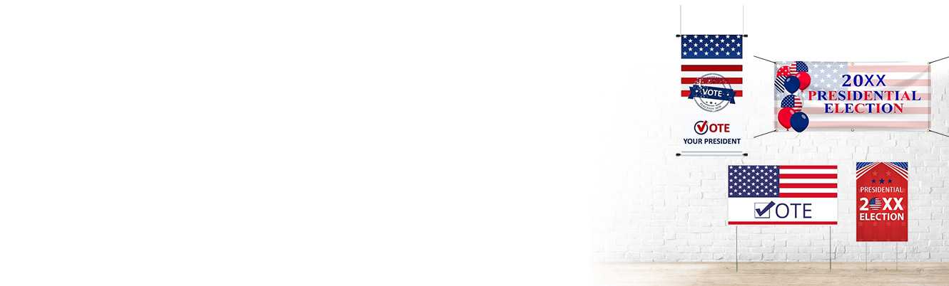
Popular Products


Why Font Choice Matters for Thanksgiving Promos
- The Psychology of Fonts: The font you choose shapes the way people experience your message. Handwritten scripts feel personal and inviting, whereas bold block fonts communicate strength and immediacy. Choosing carefully allows your neon sign to express emotion, not just text.
- Seasonal Alignment: Thanksgiving is all about coziness, family gatherings, and warmth. Fonts that reflect, soft, or nostalgic, instantly connect your message to the holiday spirit.
- Readability First: Creativity is valuable, but if your font isn’t easily readable, your message can be lost. Balancing style with clarity guarantees that your Thanksgiving signage is both eye-catching and instantly understood.
- Creating a Festive Mood: Fonts can reinforce the holiday vibe. No matter if your style is rustic, modern, or fun, the right holiday neon sign designs and fonts help your brand message shine.
- Strengthening Brand Identity: Neon signs or LED letters communicate your brand through details like fonts, color, and background. Thanksgiving fonts should celebrate the season while remaining consistent with your overall brand style.
Best Neon Sign Font Styles for Thanksgiving
Thanksgiving promotions call for fonts that stand out, but not all fonts are suitable. Wondering what font looks best on neon signs? Here are four styles that come to life in glowing neon:
Script & Handwritten Fonts

Cursive letters and handwritten fonts give a warm, friendly, and holiday-like feeling. These fonts’ flowing curves turn into neon signs beautifully, producing a cozy, inviting glow that catches attention.
Bold & Block Fonts
If your goal is to grab attention fast, bold and blocky fonts are your best bet. Their clear, bold design makes them easy to read from far away, making them perfect for messages like “Black Friday Sale” or “Holiday Discounts.” A bright, glowing block font ensures your promotions stand out in busy shopping areas.
Retro/Vintage Fonts

Retro or vintage-inspired Thanksgiving promo neon sign fonts are ideal for creating a sense of nostalgia. They give a warm, cozy charm that suits rustic stores, diners, and restaurants. The gentle neon glow turns these fonts into a nostalgic reminder of family gatherings and comforting food, making your signage feel personal and emotionally inviting.
Modern Minimalist Fonts
For brands with a chic, modern, or upscale vibe, minimalist fonts are ideal. Their crisp, understated design suits boutique stores and high-end restaurants for Thanksgiving campaigns. Minimalist lettering combined with subtle symbols neon signs creates a neon display that is both celebratory and sophisticated.
Color Pairings That Complement the Font
Selecting the right color palette is just as important when designing your custom fonts for promotional signs, as it helps set the perfect mood.
- Warm Autumn Tones: Autumn hues like deep brown, golden yellow, amber, and orange feel perfect for Thanksgiving. When paired with script or vintage fonts, they radiate warmth and seasonal charm.
- High-Contrast Combinations: To make your sign stand out, match warm fall colors with contrasting hues such as white or deep green. This keeps the text clear while preserving the seasonal look.
- Creative Layering: Experiment with multiple colors for your custom neon signs. Amber letters outlined in white give the impression of light playing across the sign. Layered effects create depth and bring a sense of festive excitement.
Conclusion
More than a holiday, Thanksgiving embodies warmth, thankfulness, and connection. Using these tips, you know how to choose a neon sign font to create a vibrant, eye-catching display. From flowing scripts to bold blocks, retro charm to minimalist sleekness, the perfect font will make your signage a true expression of the season.
Written By BannerBuzz Editorial Team!
 Posted in