








You are walking down a busy street, and you see the McDonald’s sign. Before you even realize it, your brain has already done the work. You are thinking about fries, a burger, a fountain Coca-Cola, maybe even the exact taste of it. That is what a good logo does. It gets there before the words do.
Yes, McDonald’s is an old brand, and years of advertising have helped connect the dots in our heads. But that bright yellow arch still has its own pull. It is simple, familiar, and impossible to miss. You do not need a full explanation. One glance is enough.
That is exactly why logos matter so much. They are not just pretty little graphics sitting at the top of a website. They are often the first thing people notice, the thing they remember, and the symbol they attach to your business long after they have forgotten the rest of the page. A strong logo can make a brand feel established. A weak one can make even a successful business look unsure of itself.
So if you are just starting out and wondering how to make a logo that actually feels right, this guide will walk you through it properly. We will cover the basics, the main styles, the thinking behind good design, the tools you can use, and the mistakes worth avoiding before you commit to anything.
What Is a Logo?
A logo is a visual mark that represents a business, brand, person, or product. That is the simple version. It can be a name, a symbol, initials, an emblem, or a mix of all of those things. But whatever form it takes, its job stays the same: help people recognize you quickly.
Definition of a Logo
If you want the beginner version, think of a logo as the face of your brand. Not the whole personality, not the whole story, but the face people spot first. That is one of the most important logo design basics to understand. A logo is not there to explain everything. It is there to create recognition.
Why Logos Are Important for Businesses
A logo matters because people remember visuals faster than they remember descriptions. If your brand keeps showing the same visual mark, people start connecting that symbol with your service, quality, and reputation.
It also helps with credibility. A polished, thoughtful mark makes a business feel more settled and intentional. That does not mean you need something flashy. It just means your brand should not look like it was thrown together in five distracted minutes. A professional logo gives people a little more confidence before they even speak to you.
It also keeps your branding consistent. Your website, social posts, packaging, visiting cards, storefront, email footer, and event display all need something to tie them together. That is where the logo steps in. Whether it appears on a product label, a Custom Banner, a Custom flag, or even a Custom logo mat at your entrance, it helps hold the entire brand together.
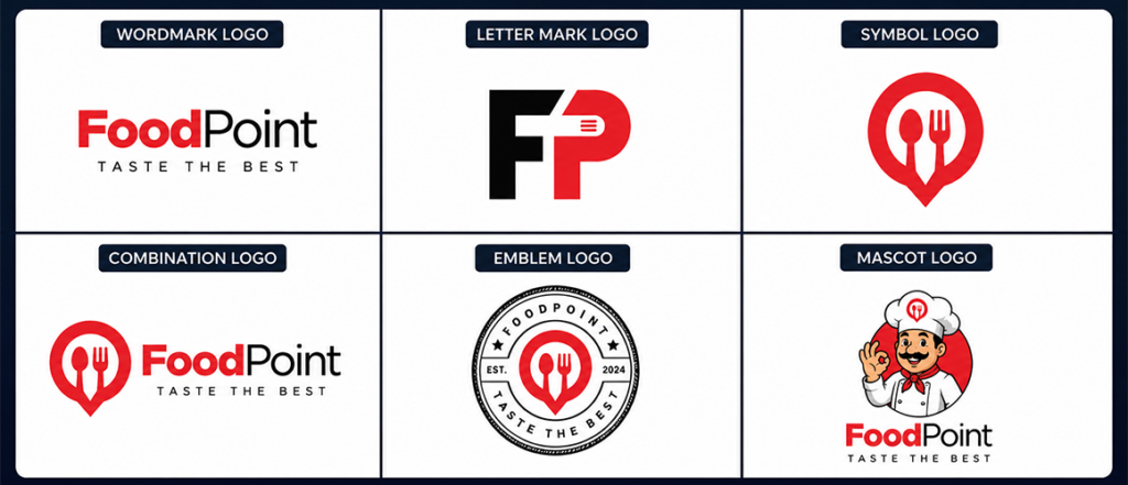
Types of Logos
Before you jump into sketching, it helps you to understand the main families. Different businesses suit different logo styles, and knowing the common types of logos makes the process feel much less random.
Wordmark Logos
A wordmark is exactly what it sounds like: the brand name designed in a distinctive way. Google and Coca-Cola are classic examples. There is no separate icon doing the heavy lifting. The name itself becomes identity.
This works best when your brand name is memorable and not too long.
Letter Mark Logos
A letter mark uses initials instead of the full name. IBM, HBO, and NASA all fit here. This style is useful when the full name is long or a bit clunky.
It is clean, practical, and often easier to place across different formats.
Brandmark or Symbol Logos
This is the icon-only route. Think of Apple’s apple or Target’s bullseye. It can be powerful but usually works best once a brand already has recognition behind it. For beginners, it can be trickier because a random symbol means nothing unless it gets repeated enough times.
Combination Logos
This is one of the safest options for newer brands. It combines text and symbol in one system. Adidas, Burger King, and Lacoste all use this idea well. It gives you flexibility because you can use the full version in some places and separate elements in others.
Emblem Logos
These logos place the name inside a badge, seal, or crest-style shape. Harley-Davidson and Starbucks are good examples. They feel more classic and structured, though they can become difficult at very small sizes if overdone.
Mascot Logos
These use a character as the main identity element. KFC and Pringles are recognizable because their mascots feel friendly and distinct. They work especially well when the brand wants personality, warmth, or a slightly playful tone.
Key Logo Design Principles
A beginner can get lost in colors, icons, and software far too quickly. Before all that, it helps to understand what makes a logo feel right in the first place.
Simplicity
The strongest logos are usually simpler than people expect. Not boring. Just clear.
Simple shapes are easier to remember, easier to place, and easier to reproduce. If a logo only works when it is large and full colour, it is probably doing too much. Good creative logo design is not about stuffing in every idea you have. It is about finding the one idea that is strong enough to carry the brand.
Memorability
A good logo should stick. That does not mean it needs to be loud or strange. Sometimes memorability comes from one smart visual twist, one distinctive letterform, or one shape that feels instantly recognizable.
This is why copying whatever looks popular online rarely works. A brand becomes memorable when it feels specific.
Versatility
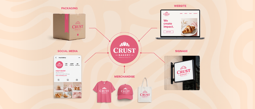
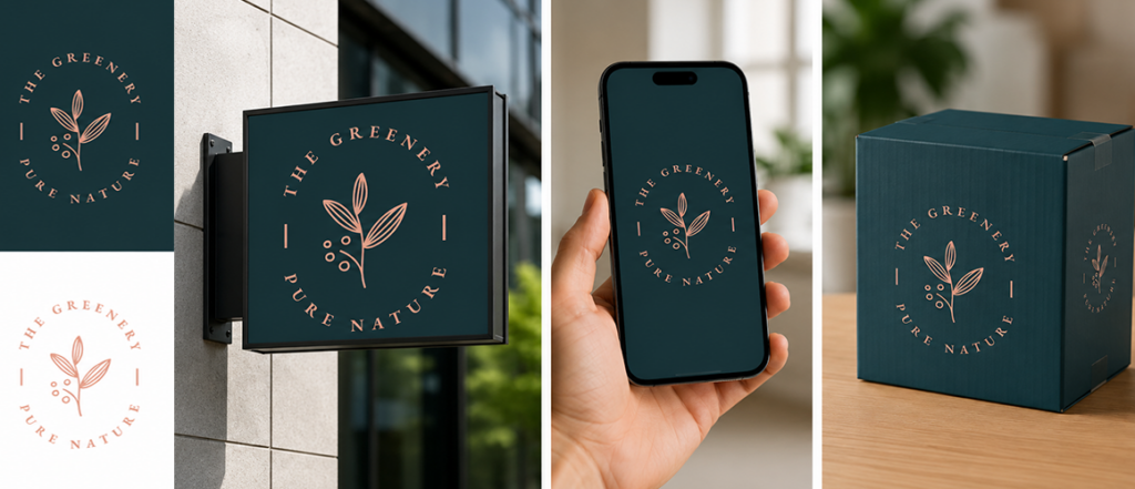
Your logo has to work everywhere. On a website header. On a product box. On business cards. On packaging. On a social profile picture. On printed merchandise. A mark that looks lovely only on a clean white screen is not enough.
Timelessness
This is where people get tempted by logo design trends and end up regretting it later. A logo should feel current, but it should not depend entirely on what is popular this year. There is a difference between fresh and temporary. Plenty of trendy logos look good for six months and then start ageing badly.
Scalability
Your logo has to hold up at every size. Huge signboard, tiny favicon, stitched uniform, invoice header, packaging label. That is why designers often build logos in vector formats. A scalable logo stays crisp without falling apart.
Step-by-Step Process to Design a Logo
Now we get into the part most beginners actually want: the real logo design process. There is no single magic formula, but there is a sensible order that makes things easier.
Step 1: Understand Your Brand
Before drawing anything, get clear on who you are.
What does your business do? Who are you speaking to? What kind of feeling should people get from your brand? Calm and premium? Loud and youthful? Serious and dependable? Creative and playful?
A children’s bakery should not look like a law firm. A luxury skincare label should not look like a gaming channel. Your logo should match the tone of the brand it belongs to.
Step 2: Research Competitors
Look at other logos in your category. Not to copy them. To understand the landscape.
You will start spotting patterns. Maybe fitness brands lean bold and heavy. Maybe cafés often go handwritten and warm. Maybe tech brands prefer clean sans-serif marks. This helps you see what is common, what is tired, and where you might go in a fresher direction.
Research also helps you avoid accidental similarity, which matters more than people realize.
Step 3: Choose the Right Logo Style
Now go back to the earlier section and decide what family suits your brand best. A wordmark might work beautifully if your brand name has character. A combination logo may be safer if you want both recognition and flexibility. An emblem might make sense if you want something heritage-inspired.
This is where the logo design guide really becomes useful, because choosing the right style early saves you from redesigning everything halfway through.
Step 4: Pick Your Logo Colors
Color does emotional work. People feel it before they explain it.
Blue often feels trustworthy. Red can feel energetic or urgent. Black tends to feel premium. Green can suggest freshness, wellness, or sustainability. Yellow feels bright and friendly when used well.
That said, color psychology is not a strict science exam. You do not need to follow it like law. But you do need to think about what your chosen logo colors are saying about your brand.
A finance company in neon pink can work, but it needs a reason. A kids’ party brand in dark grey can work too, but again, there needs to be intention.

Select Your Logo Fonts
Typography changes the whole mood of a logo. The same name can feel premium, playful, serious, elegant, or chaotic depending on the type choice.
Serif Fonts
Serif typefaces have small finishing strokes. They often feel traditional, editorial, or trustworthy. Good for brands that want gravitas or heritage.
Sans-Serif Fonts
Sans-serif fonts feel cleaner and more modern. They are widely used because they tend to be easy to read and easy to adapt across digital spaces. If you want a modern logo, this is often the first place people look.
Script Fonts
Scripts can feel elegant, expressive, or handmade. But they can also become hard to read very quickly, so they need care.
Spend time on your logo fonts. Type is not filler. For some brands, type is the entire identity.
Sketch Ideas First
Do not open a computer too early.
Take a pen and start rough. Try twenty ideas. Then twenty more. Most of your first sketches will be average, and that is fine. The point is to get obvious thoughts out of the way so better ones can show up later.
Play with initials. Symbols. Negative space. Shapes connected to your brand. This is where a lot of your early logo ideas begin to take form. Sometimes the best solution looks very different from what you expected when you started.
A few quick tips here: keep your sketches loose, do not judge them too early, and try both obvious and unexpected directions.
If you are hunting for the best creative logo ideas, this stage matters more than any software choice later.
Create Digital Versions
Once you have a few promising sketches, take them into a design tool.
This is the stage where you clean things up, adjust spacing, refine proportions, test type, and start building proper versions. If you want full control, vector software is the usual route. If you are just experimenting, beginner-friendly tools can still help you design your own logo before bringing in a pro later.
This part is where raw thinking becomes an actual logo design.
Test the Logo Properly
A logo that looks good on your artboard can still fail in real life.
Test it in black and white. Test it small. Test it large. Test it on dark backgrounds and light ones. Check if it still works when printed. Check if the type stays readable. Check whether the icon still makes sense when shrunk down.
This stage is boring, but it saves you from future embarrassment.
Tools You Can Use to Design a Logo
Not everyone needs expensive software straight away. The right tool depends on where you are starting.
Beginner Options
If you are new and want something approachable, template-based tools can be useful. Canva is popular because it is easy to understand. Wix Logo Maker is another beginner-friendly route. A basic logo maker can help you explore direction, especially when you are still figuring out what feels right.
Professional Design Tools
If you want more control, Adobe Illustrator remains one of the strongest choices. CorelDRAW is also widely used. These tools take longer to learn, but they give you the precision needed for stronger results.
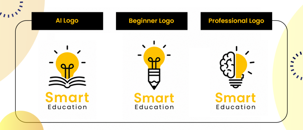
AI and Automated Tools
There are also AI-based generators like Looka or Brandmark. These can be helpful when you want speed or inspiration. But they are usually better at giving you a starting point than building a truly distinctive brand identity.
Common Logo Design Mistakes to Avoid
A lot of bad logos come from rushing. The rest come from trying too hard.
Using Too Many Colors
A logo with five or six competing shades can quickly feel messy. Start small. One or two strong colors often do more work than a rainbow.
Following Trends Blindly
Yes, it is useful to know what is happening in visual culture. No, that does not mean your brand should chase every fad that turns up on Instagram.
Making It Too Complex
If the shape is confusing or the type is hard to read, people will not work that hard for you. Clarity matters.
Copying Competitors
This is more common than people admit. You see something in your industry that looks “right,” so you lean too close to it. The result is a logo that feels familiar in the worst way.
Ignoring Scalability
Tiny details disappear. Thin lines vanish. Overcomplicated badges collapse. If it cannot survive small sizes, it is not ready.
Examples of Great Logos and Why They Work
Studying successful logos helps because you stop thinking of them as magic and start seeing the decisions behind them.
Nike
Nike’s swoosh works because it is quick, bold, and easy to remember. It feels like movement without needing a full explanation.
Apple
Apple’s mark is simple enough to work anywhere and distinctive enough to stand on its own. It does not need decoration.
FedEx
FedEx is a favorite among designers because of the hidden arrow between the E and the x. It is clever without being loud. That is the sweet spot.
When to Hire a Professional Logo Designer
Doing it yourself makes sense when you are testing an idea, launching something small, or working with a very limited budget. But sometimes DIY is not enough.
If you are building a larger business, planning a major rebrand, creating a full identity system, or entering a more competitive market, it may be worth bringing in a designer. A professional sees things beginners often miss: spacing problems, balance issues, weak symbolism, poor typography choices, and long-term usability.
The truth is, not every brand needs an agency. But some projects absolutely benefit from outside expertise.
Final Checklist Before Launching Your Logo
Before you officially use the logo everywhere, stop and run through this list:
- Does it work in black and white?
- Is it readable at small sizes?
- Does it feel consistent with your brand personality?
- Is it memorable without being overcomplicated?
- Does it look good on screen and in print?
- Can it work across packaging, social media, signage, and merchandise?
- Have you tested it on both light and dark backgrounds?
- Are the type and spacing properly refined?
If the answer is yes to all of those, you are in a much stronger place.
Frequently Asked Questions About Logo Design
How do I design a logo for beginners?
Start by understanding your brand, then research your category, choose a suitable style, pick colors and type, sketch a lot of rough ideas, and only then move into digital tools. Beginners usually do better when they keep things simple rather than trying to prove too much.
What makes a logo successful?
A good logo is simple, memorable, versatile, scalable, and suited to the brand behind it. It should feel intentional, not random, and clear, not overloaded.
What software is best for logo design?
For beginners, easy tools like Canva can help. For more advanced work, Illustrator is a strong standard. The right option depends on your skill level and how much control you need.
How much does it cost to design a logo?
It can cost almost nothing if you are experimenting with templates, and much more if you hire a professional freelancer or agency. The cost usually reflects how custom, strategic, and polished the result needs to be.
Can I design a logo without design experience?
Yes, absolutely. You can create your logo using simple tools, templates, and a lot of trial and error. The trick is to stay realistic. Keep it clear, test it properly, and do not force complexity just to make it look “designed.”
Final Word
A logo is a small element that performs a very important function.
It has to introduce your brand, stay memorable, feel trustworthy, and work everywhere from screens to packaging to print. That is a lot to ask from one mark. But when it is done well, it can carry a huge amount of value.
So do not rush it. Learn the basics. Look around. Sketch more than you think you need to. Test everything. And remember that the goal is not to make something trendy for the sake of it. The goal is to make something true to the brand and easy for people to recognize.
That is really the heart of how to design a logo well: less noise, more clarity, and just enough character to make people remember you.