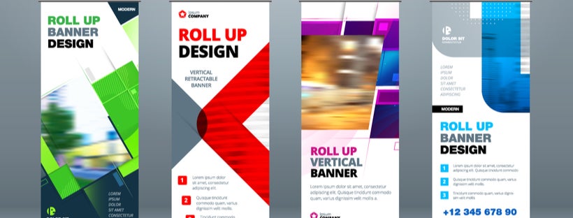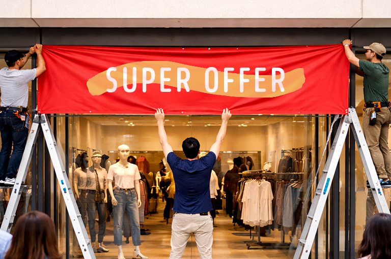


Designing a banner for your business is a complex task that requires several elements necessary to be effective. Whether you’re making outdoor vinyl banners, cloth banners, or step and repeat banners, there are four important factors to consider to create the most effective banners that drive messaging home and generate more revenue for your business.
-
Making Use of Directional Banner Signs
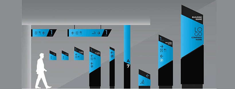
To provide a clear and thorough understanding of the services and products you provide, make sure to communicate directional-based messages to your audience.
Whether highlighting sale percentages or the main message, properly designed directional arrows and shapes serve the function of putting your brand in the forefront of the customer’s mind while giving them easy-to-follow directions.
Some of the guidelines that you should follow while designing both attractive and practical directional banner stands are:
- Use a simplistic design
- Keep text at a minimum
- Use arrows strategically
- Display signs at all important points
-
Choosing Your Messaging Wisely
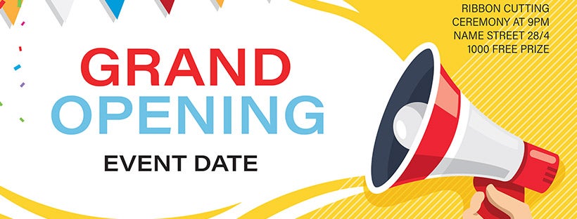
When it comes to banners, you have a limited space to get your message across. This makes it important that your banner copy can be read and understood quickly. Otherwise, you could run the risk of losing the customer’s attention.
Make sure that your messaging is clear, simple to understand, and helps you achieve your purpose, which could be any of the below:
- Highlighting your new product
- Increasing brand awareness
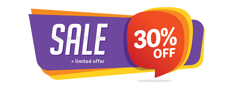
- Calling customer attention to a sale or promotion
- Rebranding or changing the public’s perception of your brand
- Promoting an upcoming event
Keep in mind that plenty of banner ads are successful just by being simple. Many potential customers will be walking or driving by your banner, so it is incredibly important to figure out an appropriate way to communicate your message with as few words as possible so it can be read in an instant.
-
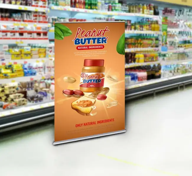
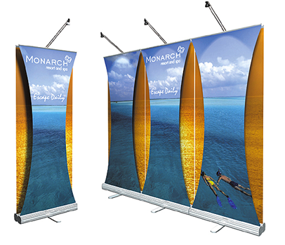
Make the Right Color Choice
Color plays a key role in attracting audiences. Color is the first thing customers notice. In fact, our brains process visual information up to 60,000 times faster than text. Since when our brains process colors they evoke different emotions, it is crucial to consider what types of specific emotions you want your customers to experience.
Another thing to keep in mind is that colors are subjective, with varied associations based on culture. If your company sells internationally, this makes it vitally important to understand the culture of your audience when making your color selections. Here is a breakdown of how different colors create a psychological effect on customers and evoke varied emotions:
- Yellow: sends out energy that is youthful and affordable. It evokes emotions such as cheerfulness, sunshine, and friendliness.
- Red: powerful and attractive to most audiences and evokes passion, love, and excitement. However, the key is to use it in moderation or to avoid it if you are looking for a more mature, classic, or serious look.
- Orange: makes you feel energized and enthusiastic and evokes a feeling of vitality and happiness. Similar to red, it draws attention but is not as overpowering. Orange can be great as a call to action to buy or subscribe to a product.
- White: creates feelings of economic sense and youth in the audience and evokes emotions such as cleanliness, modernity, simplicity, honesty, and innocence.
- Green: makes you feel refreshed, optimistic, and symbolizes new beginnings, health, and wealth. It is an excellent color to use if you wish to depict security, growth, or inspire possibility. It can also feel calming and relaxing to anyone looking at it.
- Blue: one of the most common colors that appears on banners and in logos. It evokes emotions like serenity, safety, clarity, intellect, maturity, masculinity, and formality. Light blues offer a more relaxing, friendly feel.
- Brown: creates a sense of stability and support. It’s friendly, warm, practical, dependable, and can also represent the well-established and old-fashioned.
- Black: evokes feelings of luxury, power, elegance, and, at the same time, can also represent neutrality, simplicity, and professionalism. It’s powerful, bold, and is mostly used to evoke mystery. In certain cultures and contexts, the black color can also refer to mourning or sadness.
Remember that colors and emotions are closely linked, so it is important to consider their effects whenever you are using them in banner stands.
-
Remember Copy and Color Are Everything
To make your banner successful, your art and text must reflect the same message or values. Otherwise, your customers will feel confused, lost, and soon lose interest. It’s very important to keep your art and graphics refreshing and consistent with the font and tone of your copy. This creates a symbiotic relationship that leads to a cohesive whole rather than either (design or text) becoming prominent and grabbing too much attention or cancelling the other out.
Contrast is also very important. If your copy/text color isn’t a contrasting color to the rest of your color palette, your messaging will get lost. Turning your color choices into grayscale is a great technique for measuring contrast. Colors contain varying degrees of light, and this light is what creates the contrast you need to have your message stand out from your chosen brand colors.
References:
How Our Brains Are Hardwired for Visual Content
https://killervisualstrategies.com/blog/how-our-brains-are-hardwired-for-visual-content.html