








Outdoor advertising has never faced more competition for human attention than it does right now. The average person navigating a street, a neighborhood, or a commercial corridor is simultaneously managing a phone notification, half-remembering a conversation, and mentally rehearsing the next item on their to-do list.
Against that backdrop of perpetual distraction, a yard sign has a narrow, almost brutally short opportunity to break through typically two to three seconds for a pedestrian, lever. In that compressed window, the visual hierarchy of perception takes over entirely. Shape registers first, then color, then contrast, and only then if the sign has survived all three filters does the brain attempt to read text.
Popular Products




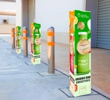
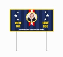
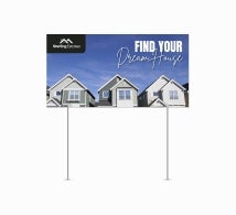


Most standard rectangular signs never make it past the first filter. They’re processed, categorized as familiar, and discarded in milliseconds. Breaking that pattern starts with the outline of the sign, long before the design conversation even begins.
In this blog, we’ll discuss why the physical shape of a yard sign is often more important than businesses realize and how custom silhouettes help signs break through visual clutter.
The Problem with Blending In
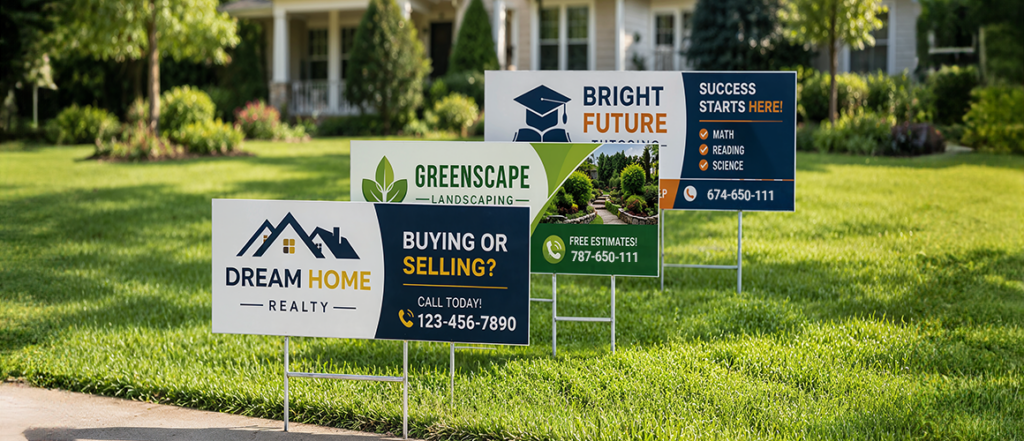
Walk down any busy street during election season or past a neighborhood garage sale, and you’ll see dozens of signs staked into lawns and median strips. Most of them share one thing in common: they’re flat, four-cornered rectangles. That uniformity is precisely the problem.
The human brain is wired to detect patterns and, more importantly, to notice when something breaks them. When every sign on a block looks structurally similar, none of them truly command attention. They become visual wallpaper. This is the silent struggle that plagues standard yard signs, not because they’re poorly designed, but because their shape sets them up to disappear into the crowd.
Die-cut yard signs vs standard yard signs comes down to this fundamental difference: one follows convention, and the other breaks it.
What Exactly Is a Die-Cut Sign?
A die is a hardened cutting tool, custom-formed into a specific shape, that slices through material cleanly and precisely. When a sign goes through this process, it emerges trimmed to a unique outline no longer confined to the rectangular shape that a conventional printing press imposes on every piece it produces.
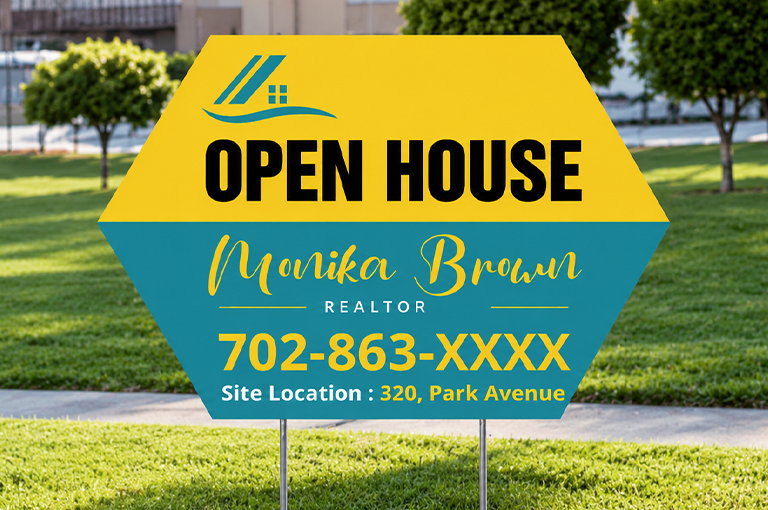
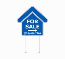
Also known as contour-cut yard signs, these pieces are shaped to follow the design itself. Imagine a sign for a pizza restaurant shaped like a slice of pizza, or a real estate sign trimmed into a house silhouette. The shape becomes part of the message. The form reinforces the brand. That’s an entirely different level of communication compared to words printed on a generic background.
The Power of Shape in Visual Communication
Humans process visual information before they process language. Long before the conscious mind processes a single word, the eyes have already catalogued shape, color, and motion. That is why savvy marketers treat visual contrast not as decoration but as a primary communication strategy.
Custom shape yard signs put this cognitive shortcut to work in the most direct way possible. A silhouette that mirrors a product or reflects a brand’s identity doesn’t need to be read or analyzed. It simply connects, instantly and automatically, at a level beneath conscious thought. There’s no lag between seeing and understanding, the shape does the heavy lifting before the text even registers.
This is especially valuable in high-traffic environments where a sign might be visible for only a second or two from a passing car. In that brief window, a unique silhouette communicates instantly in a way that a block of text on a rectangle simply cannot.
Comparing Formats: From Arrows to Ovals
To appreciate the range of possibilities, it helps to look at specific shapes and how they function.
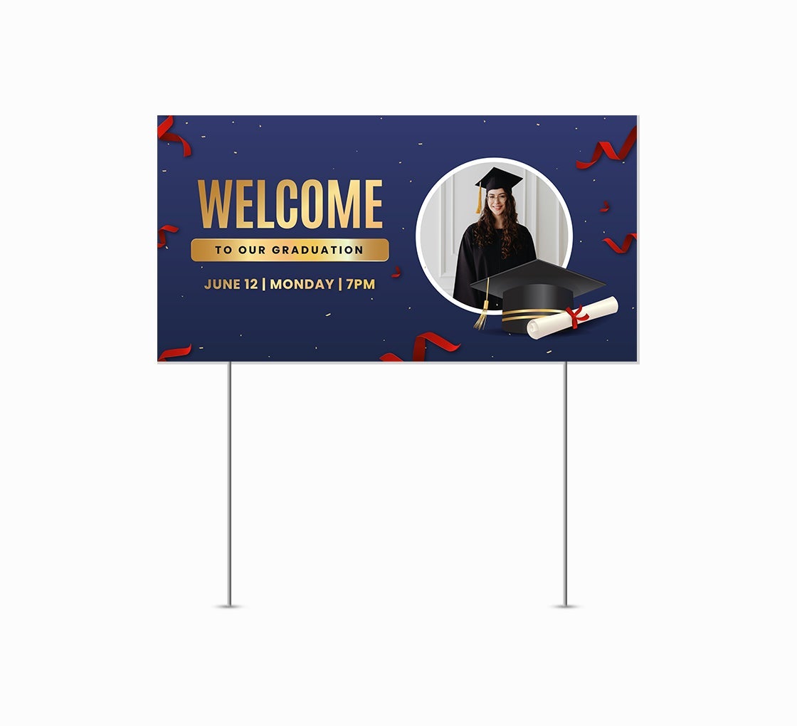
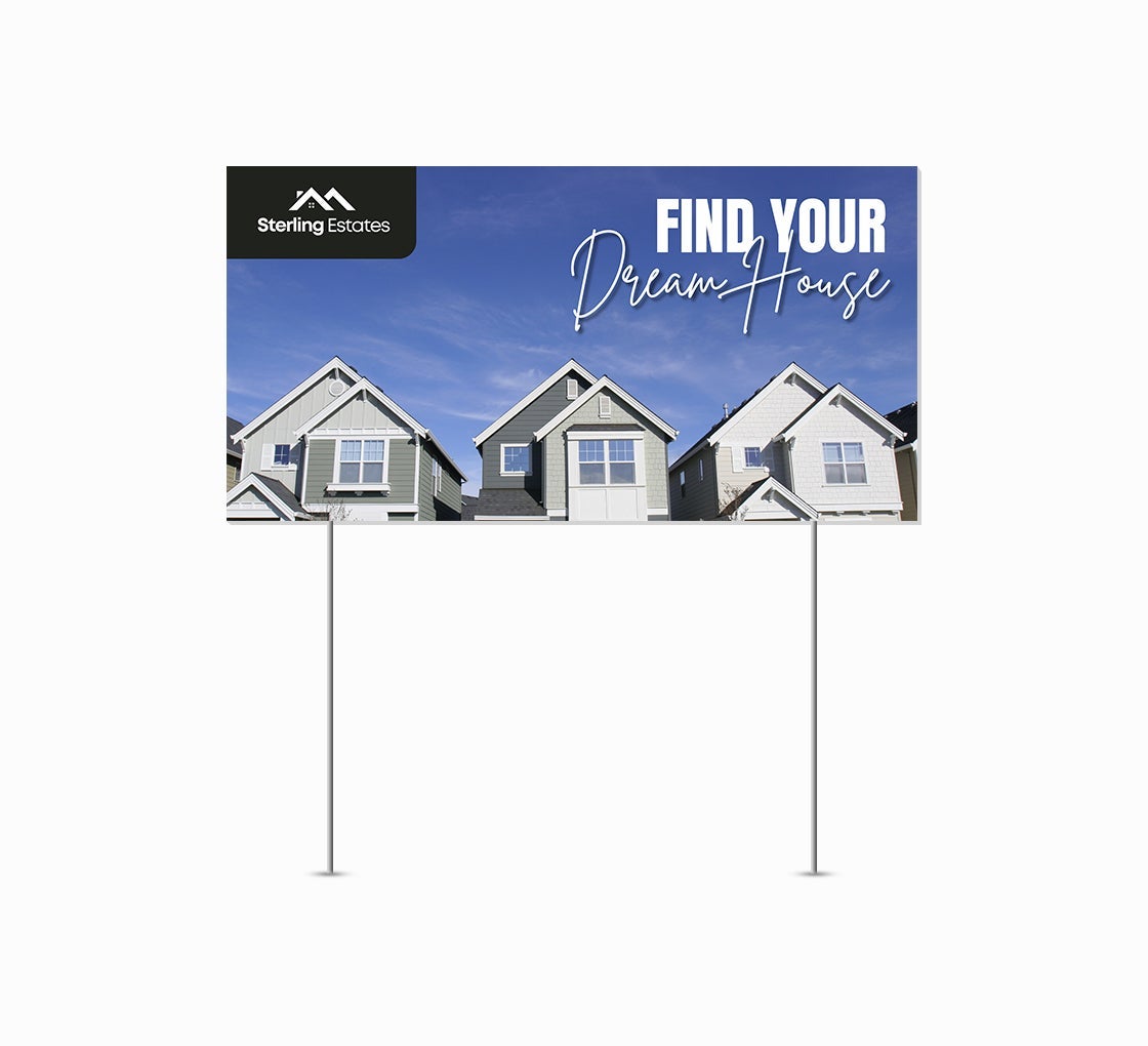
Rectangle yard signs are the industry default for a reason; they’re economical, easy to stack, and compatible with standard H-stakes. For high-volume campaigns where budget is the primary constraint, they get the job done. But “getting the job done” and “making a lasting impression” are two very different outcomes.
Circle yard signs introduce a warmth and approachability that sharp corners never achieve. They’re excellent for lifestyle brands, children’s services, or any business that wants to project a friendly, community-oriented image. A circle also draws the eye inward, naturally directing attention to whatever’s at the center of the design.
Oval yard signs split the difference between the rigid rectangle and the perfect circle. They carry a classic, slightly formal elegance: think of wine labels, heritage brands, or professional services that want to communicate refinement without being stiff. An oval in a field of rectangles will always catch the eye.
Then there are arrow yard signs, arguably the most functionally clever of all shapes. Point someone in the right direction, and they’re already mentally moving toward your location. An arrow-shaped sign does double duty: it delivers directional information and reinforces it visually through its form. For pop-up events, open houses, or any situation where foot traffic needs guiding, an arrow-shaped sign is practically a navigation tool.
Custom Die-Cut Signs and Brand Identity
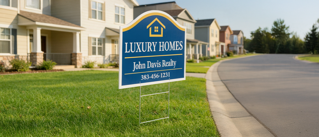
For businesses investing in outdoor advertising, custom die-cut yard signs represent something beyond mere visibility, they represent brand coherence. Every touchpoint a potential customer has with your brand is an opportunity to reinforce who you are and what you stand for.
A sign shaped like your logo, your mascot, your product, or a symbol synonymous with your industry tells a story without a single word. It signals that your brand is thoughtful, professional, and invested in presentation. That kind of first impression has real commercial value.
Compare that to business advertising yard signs that are rectangular and generic. Even with beautiful artwork, they carry an implicit message: “We printed the default option.” That may be unfair, but perception drives behavior, especially in advertising. Custom yard signs in distinctive shapes communicate intentionality. They say your brand is serious about showing up.
Yard Sign Size and Shape: A Combined Strategy
It’s worth noting that shape and size work together as a system. Yard sign size influences visibility from a distance, a larger sign catches attention from farther away but shape determines whether that attention is retained once someone is close enough to read it.
A large rectangle might be noticed from across the street, but a medium-sized silhouette of a running dog for a pet business will be remembered. Size gets you seen; shape gets you remembered. The most effective outdoor campaigns think about both dimensions simultaneously, using shape to create intrigue and size to ensure legibility.
Political Signs and the Case for Standing Out
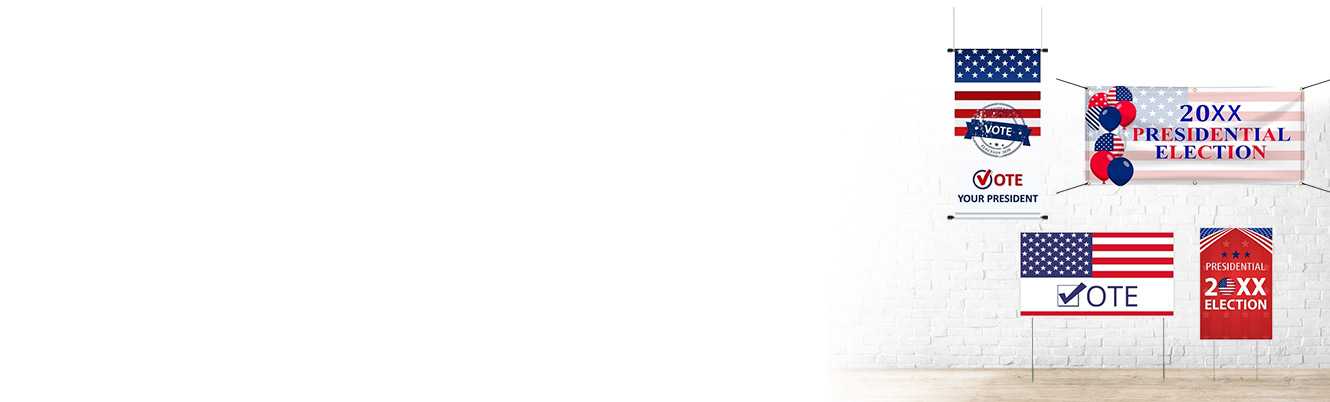
Nowhere is the sea of sameness more obvious than during election season. Lawns and roadsides fill up with nearly identical political signs, same proportions, same general layout, same forgettable format. In that environment, a candidate or measure that invests in a distinctive silhouette immediately signals something different is happening.
This doesn’t mean gimmicky. A well-designed die-cut political sign, perhaps shaped to echo a local landmark, a state outline, or a bold graphic element, communicates that the campaign is creative, resourceful, and willing to do things differently. In a race where name recognition is everything, that visual differentiation can translate directly into votes.
Durability and Production Quality
One common misconception is that custom shapes somehow compromise sign durability. In reality, modern die-cutting technology works with the same high-quality corrugated plastic (coroplast) used in standard yard signs. The material is weather-resistant, UV-stable, and capable of withstanding weeks of outdoor exposure without fading or warping.
The cutting precision has also improved dramatically. Contemporary production equipment can follow intricate contours cleanly, meaning even complex shapes maintain crisp, professional edges that look polished in any setting.
Cost Vs ROI
Yes, die-cut signs typically carry a higher per-unit cost than their rectangular counterparts. But advertising is never purely about cost, it’s about return. If a distinctive shape results in even marginally higher recall, more inquiries, more foot traffic, or more votes, the investment justifies itself quickly.
For short-run, high-impact campaigns, a grand opening, a limited-time promotion, a ballot initiative, the premium for a custom silhouette is often among the best money spent in the entire marketing budget.
Conclusion
Signs have one job: to be seen and remembered. Every design decision, from color to typography to material, serves that goal. But shape may be the most underutilized lever of all.
By choosing a form that breaks from convention, reflects your brand, and exploits how human perception actually works, you transform a simple stake sign into a genuine piece of visual communication. That’s the promise of the die-cut approach and it’s one that standard formats, simply cannot match.
The next time you’re planning a signage campaign, don’t just think about what your sign says. Think about what its shape says before anyone reads a single word.