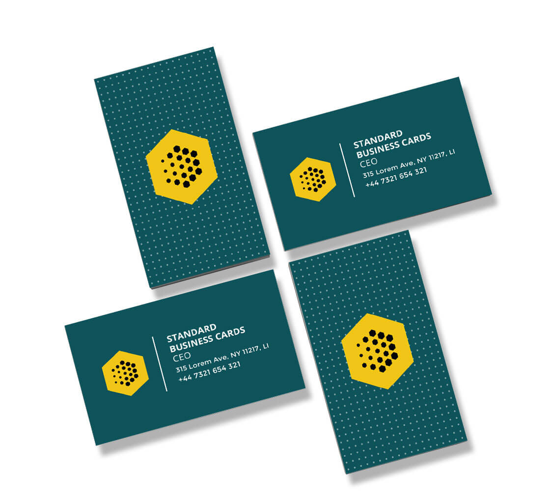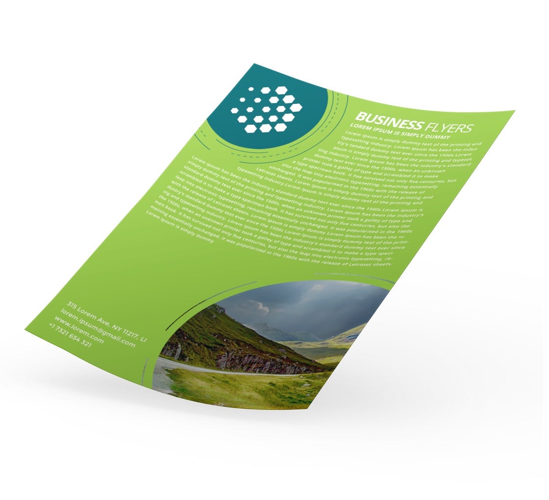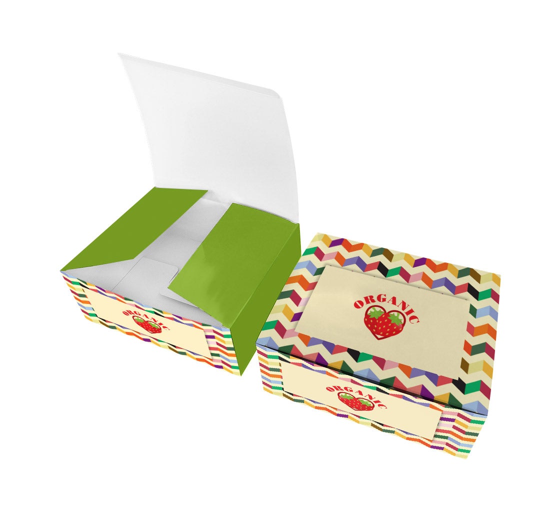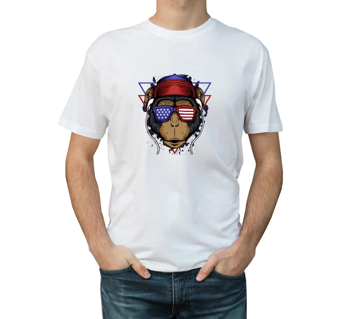








Have you ever spent hours creating a stunning poster or flyer on your computer screen, only to feel disappointed when you see the printed result? The electric blues look dull, bright greens appear muted, and reds may not look as vibrant as they did on screen.
This happens because screens and printers use different color systems. RGB creates colors using light, while CMYK creates colors using ink. Understanding what is the difference between RGB and CMYK can help you choose the right color mode before you begin designing.
In this guide, we will explain RGB and CMYK individually, compare how each color mode works, and show you when to use each one for digital designs and print projects.
Popular Products









What Is RGB and How Does It Work?

RGB stands for Red, Green, and Blue. It is an additive color model designed primarily for digital displays.
Your smartphone, laptop, television, desktop monitor and many other digital displays use RGB light to produce colors. The system starts with black and adds different intensities of red, green and blue light to create a wide range of shades.
Think of RGB like three colored spotlights shining onto the same surface. When red, green and blue light overlap at full intensity, they produce white light. When all three are turned off, the result is black.
Where Is RGB Used?
RGB is generally suitable for designs that will be viewed on digital screens, including:
- Websites and web graphics
- Social media posts
- Digital advertisements
- Email graphics
- Mobile applications
- Video content
- Presentation slides
- Digital photography
Because RGB uses light, it can produce highly vivid and saturated colors that may not be possible to reproduce with physical ink.
Read Also: Inside the World of Graphics and Printing Techniques
What Is CMYK and How Does It Work?

CMYK stands for Cyan, Magenta, Yellow and Key (Black). It is a subtractive color model commonly used for physical printing.
Unlike a screen, paper does not produce its own light. It reflects light from its surroundings. CMYK inks work by absorbing certain wavelengths of light and reflecting others back toward the viewer.
When Cyan, Magenta, Yellow and Black inks are combined in different proportions, they can reproduce a broad range of colors on physical materials.
Where Is CMYK Used?
CMYK is commonly used for printed products such as:
- Flyers
- Posters
- Packaging
- Printed marketing materials
- T-shirts and other merchandise
For print projects, preparing artwork in the appropriate color mode can help reduce unexpected color changes during production.
Understanding the Basic Color System Differences
The main difference is how each color system produces an image. RGB adds light to create colors, while CMYK uses ink to absorb and reflect light.
| Feature | RGB | CMYK |
| Primary colors | Red, Green, Blue | Cyan, Magenta, Yellow, Black |
| Color process | Additive | Subtractive |
| Designed for | Digital displays | Physical printing |
| Color range | Wider | More limited than RGB |
| Base appearance | Black screen | White paper |
| Best suited for | Websites, social media, videos | Flyers, posters, business cards, packaging |
| Color creation | Uses light | Uses ink |
Why Do RGB and CMYK Colors Look Different?
One of the biggest reasons RGB and CMYK colors can look different is their color gamut, or the range of colors they can reproduce.
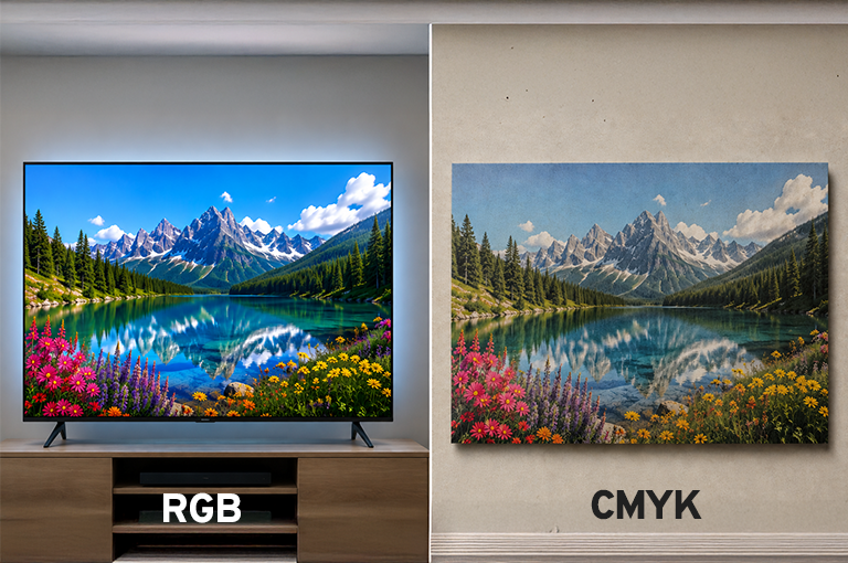
RGB can display extremely bright and saturated colors because screens emit light directly. Printed materials depend on physical ink and the way that ink interacts with the surface, so they cannot reproduce every color that a screen can display.
For example, a bright electric blue may look extremely vivid on your monitor but appear more muted when printed. The same can happen with neon greens, intense pinks, and other highly saturated colors.
When an RGB file is prepared for CMYK printing, colors that fall outside the printable range need to be converted to values that can be reproduced with physical inks. This can result in visible color shifts.
Read More: How to Design a Business Card
How Is RGB and CMYK Used for Printing?
When considering RGB vs. CMYK for printing, CMYK is generally the preferred color mode because it corresponds to the four ink colors used in traditional process printing.
However, this does not mean every print workflow requires you to manually convert your artwork to CMYK. Some modern printing systems can accept RGB files and perform color conversions during production.
The safest approach is to follow the specifications provided by your print provider. If they request CMYK artwork, convert your file during the design process so you can review the color changes before production.
How Do You Know What to Choose?
If you are asking, should I use RGB or CYMK for printing, the answer depends on your printer’s requirements and the type of printing process being used.
For traditional CMYK printing, preparing your artwork in CMYK gives you a better idea of how colors may appear after production. However, some digital printing workflows may accept RGB files and handle the conversion themselves.
Before exporting your final artwork:
- Check your printer’s file specifications
- Confirm the required color profile
- Convert your artwork if CMYK is requested
- Review colors after conversion
- Request a proof when color accuracy is important
This simple check can help prevent unexpected color changes and unnecessary reprints.
What Are the Best Tips for Preparing a Print File?
Following a few basic steps can make the transition from screen to print much smoother.
1. Set Up Your Document Correctly: If your printer requires CMYK artwork, select the appropriate CMYK color profile when creating your document in software such as Adobe Photoshop, Illustrator, or InDesign.
2. Convert RGB Images Early: If your design contains RGB images but the final artwork needs to be CMYK, convert them during the design process rather than immediately before sending the file to production. This gives you time to identify and adjust colors that change significantly.
3. Check Your Printer’s Requirements: A professional printing design guide may include specifications for color profiles, bleed, resolution, file formats and other pre-press requirements. Always follow the specifications provided by your printer because requirements can vary between printing processes.
4. Pay Attention to Black: Large areas of black may require a specific black ink combination depending on the printing process. For example, some printers may recommend a rich black for large solid areas, while 100% K may be preferred for small text. Always follow the printer’s recommended values instead of assuming one formula works for every project.
5. Request a Proof for Important Projects: If color accuracy is particularly important, request a physical proof before ordering a large quantity. A proof lets you compare the printed result with your original artwork and identify potential color differences before full production.
Understanding How to Pick the Best Color Mode for Printing?
The best color mode for printing depends on the printing process, the printer’s requirements, and the type of artwork you are producing.
As a general rule:
- RGB: Best for digital screens.
- CMYK: Commonly used for traditional process printing.
- Printer specifications: Always take priority when preparing production artwork.
- Physical proof: Recommended when exact color appearance matters.
If the same campaign includes both digital and printed materials, prepare each version according to its final output rather than assuming one color mode will work perfectly everywhere.
Which One Should You Choose?
The choice becomes much easier when you focus on the final destination of your design.
| If your design is for… | Recommended color mode |
| Website | RGB |
| Social media | RGB |
| Email graphics | RGB |
| Digital advertisements | RGB |
| Video | RGB |
| Business cards | CMYK |
| Flyers | CMYK |
| Brochures | CMYK |
| Posters | CMYK |
| Printed packaging | CMYK |
Note: Always check your printer’s specifications because some digital printing workflows may use different color requirements.
Read More: Essential Graphic Guidelines for Designing Your Banners
Final Thoughts
Understanding RGB vs. CMYK becomes much simpler when you consider where your design will be viewed.
Use RGB when your artwork is intended for screens, websites, social media, videos, or other digital applications. Use CMYK when your artwork is being prepared for a printing process that requires CMYK output.
Most importantly, check your print provider’s specifications before exporting your final file. Color management, the printing process, substrate, and printer settings can all affect the final result.
Frequently Asked Questions
Q1. Can I print an RGB file?
Ans. Yes. Some modern printing systems can accept RGB files and convert them during the printing process. However, you should always check your printer’s requirements before submitting artwork.
Q2. Is CMYK more accurate than RGB for printing?
Ans. CMYK gives you a better representation of colors that can be reproduced through traditional process printing. However, the final appearance also depends on the printer, ink, substrate, and printing process.
Q3. Why do my printed colors look dull compared with my screen?
Ans. Screens produce color using light, allowing them to display some highly saturated colors that physical inks cannot reproduce. During conversion from RGB to a printable color space, some coolers may therefore appear less vibrant.
Q4. Should I convert my images from RGB to CMYK before printing?
Ans. If your printer specifically requests CMYK files, converting during the design process gives you an opportunity to review and adjust color changes before production. If the printer accepts RGB files, follow their recommended workflow instead.
Q5. What happens if I use CMYK for a digital design?
Ans. Your design may still display correctly on a screen, but RGB is generally better suited to digital output because screens use red, green, and blue light to display color.
By choosing the appropriate color mode early and reviewing your artwork before production, you can reduce unexpected color shifts and create print materials that stay much closer to your original creative vision.