


Tapping into the power of color is a pivotal aspect of effective marketing and advertising. Why? Because color isn’t just a visual experience – it’s a direct pathway to our emotions. It’s like a secret language that triggers chemical reactions in our brains, creating a symphony of feelings, whether it’s joy, sorrow, anger, or a sense of calm.
Why Does Customization of Advertising Materials with Specific Colors Matter?
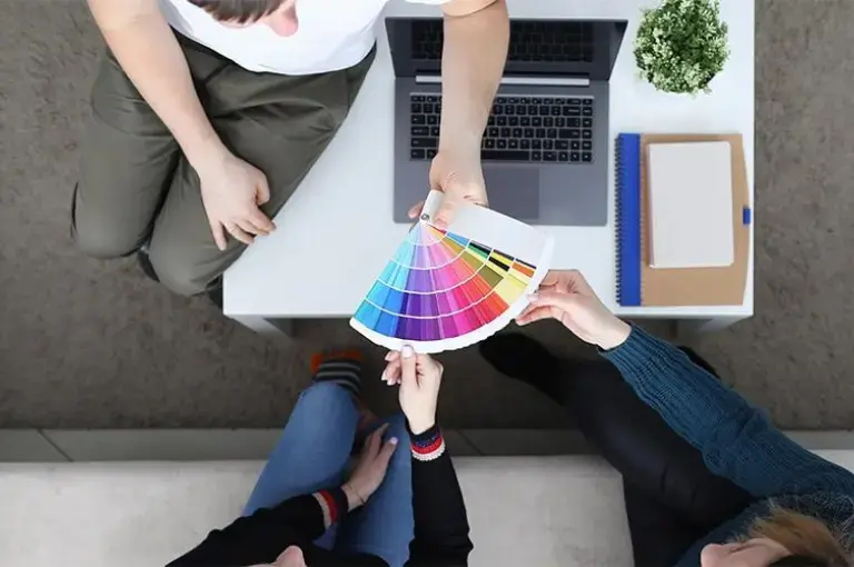
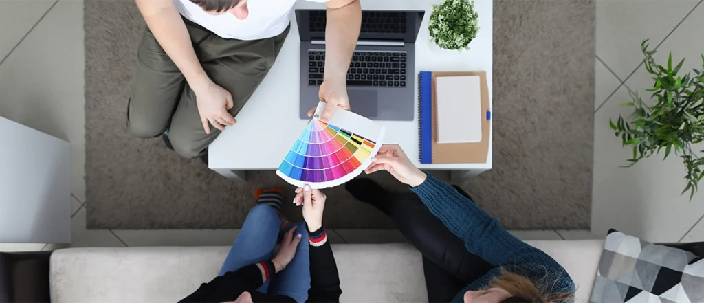
To maximize the marketing potential of promotional products customization with specific colors is key. Numerous advertising products can be personalized with optimal colors, and it is essential to regularly update these hues in accordance with design trends to ensure the ongoing relevance of marketing materials in 2024.
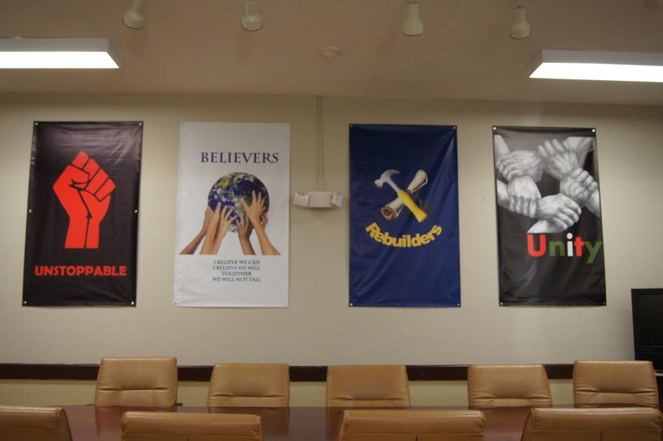
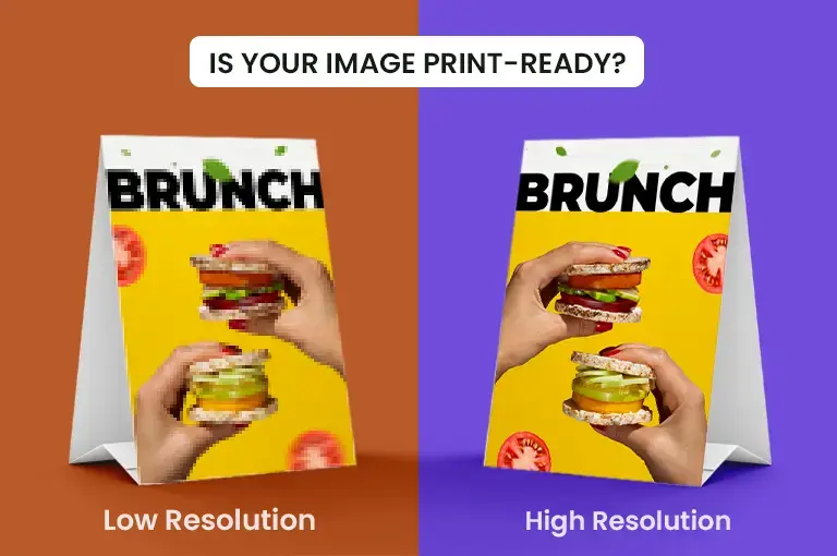
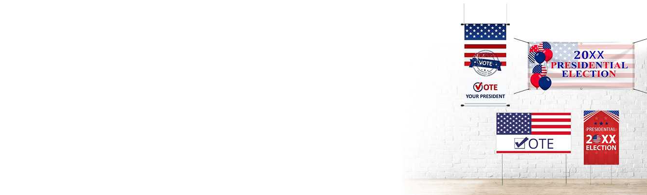
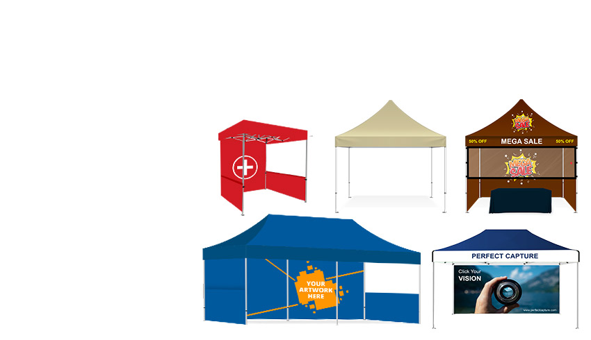
Instead of concentrating solely on verbiage of advertising banners, consider designing a color scheme that fosters creativity. Notably, for vinyl banners, vibrant backgrounds and high-contrast text enhance visibility. Flags benefit from bold, brand-aligned colors and dynamic patterns. Canopy Tents should feature cohesive color schemes for a professional look, with high-contrast elements for important information. Custom Polo Shirts should align with the brand’s color palette, with logos in contrasting or complementary colors.
Colors That are Proven to Boost Sales

It has been proven that bargain buyers react more to products that are navy blue or teal. Impulse buyers react more to red, orange, black, and royal blue, and traditional clothing buyers – the ones that buy something when they absolutely need it – react to pink, sky blue, and soft colors. Everyone, however, steers away from brown. Brown has negative effects across the board. Does it mean it cannot be a minor, complimentary color? No, but why take the chance?
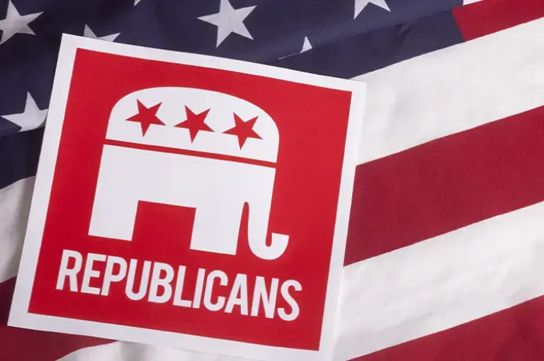
- Blue: Trust and Professionalism
Blue is a perennial favorite in marketing, known for instilling feelings of trust, reliability, and professionalism. Brands seeking to convey a sense of stability often incorporate shades of blue into their logos and marketing materials.
- Red: Excitement and Urgency
The color red is a powerful stimulant, evoking excitement and urgency. It’s frequently employed in sales promotions to capture attention and create a sense of immediacy, making it a popular choice for limited-time offers and discounts.
- Green: Health, Eco-friendliness, and Growth
Green, associated with nature, health, and eco-friendliness, is a compelling choice for brands focusing on sustainability and growth, appealing to environmentally conscious consumers. Especially, when applied to custom polo shirts, it not only communicates a commitment to eco-friendly practices but also imparts a fresh and vibrant look, aligning your brand with a sense of style and responsibility
- Yellow: Attention-Grabbing Optimism
Yellow is a vibrant and attention-grabbing color that communicates optimism and energy. Brands looking to convey a positive and youthful image often integrate yellow into their marketing collateral.
- Orange: Energy and Enthusiasm
Orange exudes energy and enthusiasm, making it a dynamic choice for brands aiming to capture attention and convey a sense of vibrancy. It’s often used to create a bold and impactful visual presence.
- Black: Sophistication and Luxury
Black signifies sophistication and luxury. Its timeless elegance makes it a popular choice for high-end brands looking to convey a sense of exclusivity and premium quality.
- Purple: Creativity and Luxury
Purple is often associated with creativity, luxury, and royalty. Brands seeking to evoke a sense of opulence or artistic expression often incorporate shades of purple into their marketing materials.
- Pink: Youthful and Romantic
Pink appeals to a youthful and romantic audience. It’s a versatile color that can convey a sense of playfulness and warmth, making it suitable for a range of products and services targeting diverse demographics.
- Gold: Prestige, Luxury, and Quality
Gold is synonymous with prestige, luxury, and quality. Often used to signify excellence and exclusivity, gold accents can elevate a brand’s perceived value and appeal.
- White: Simplicity, Purity, and Cleanliness
White symbolizes simplicity, purity, and cleanliness. Brands aiming for a minimalist and modern aesthetic often leverage white backgrounds to create a clean and sophisticated visual identity.
While these colors have demonstrated their effectiveness in various promotional products including Vinyl Banner, Flags, Canopy Tent, Custom Polo Shirt, it’s important to note that color trends can evolve over time.
Cultural Color Interpretation
As if analyzing color wasn’t tricky enough, color can also mean different things in different cultures. The first part of any marketing scheme, especially before picking a color, is to figure out your target audience’s cultural background. As the variance can be quite large, there is definitely no one-size-fits-all solution. For example, yellow in Japan is used for courage, in the US it’s used for cowardice, in Latin America, it’s used for mourning, and in China it’s a vulgar color with vulgar connotations. Doing heavy research on your target audience’s culture can make or break your product and sales even before they’ve hit the shelves so doing your best on research in this department precisely is key to having a positive step forward early in your marketing and advertising design.
Crucial Last Step: Test the Colors
After selecting your colors, incorporate insights gained from split testing into your marketing and advertising campaigns. Apply the same split-test approach to vinyl banners, signs, and T-shirts. Over time, you will determine which ad elicits a stronger response. Subsequently, you can focus on the primary colors that consistently yield positive results for all your materials.
Lastly, remember to test different colors for specific purposes. While vibrant, motivating colors are generally suitable for Call to Actions (CTAs), you may find that for certain products, these colors can be jarring. Ask yourself the philosophical question: What is the fundamental purpose of this item? Then, consider the emotion behind that purpose and match it with colors, choosing combinations to test accordingly.
Written by