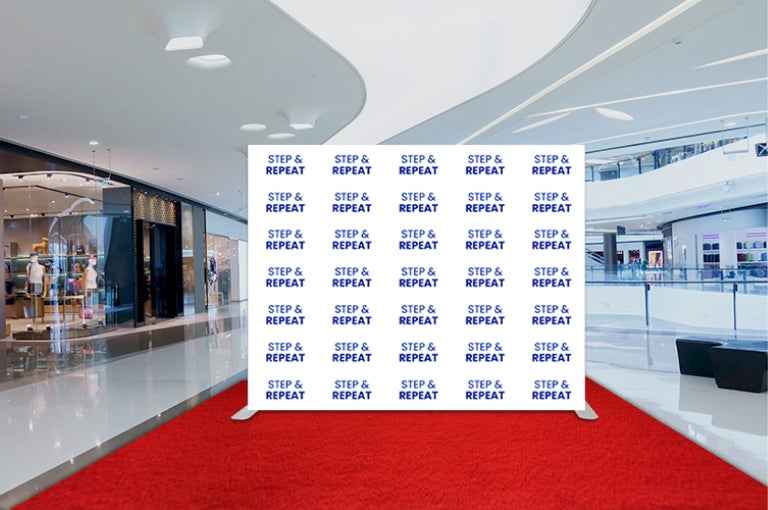

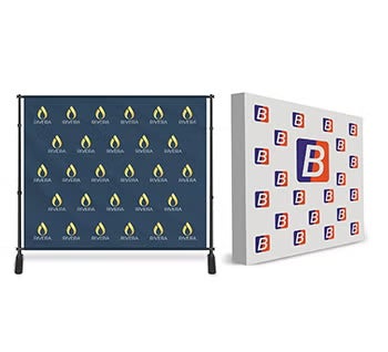


Choosing the best color combinations and sizes for step and repeat banners depends on various factors, including the event theme, branding guidelines, and venue space. When referring to color combinations, it typically encompasses the background and text color. However, it can also include additional design elements such as logos, graphics, or decorative accents that complement or contrast with the background and text colors.
Here are the 11 popular color combinations and recommended sizes that can help create visually appealing and impactful banners in 2024.
- Black and White/Gold: This classic combination offers timeless elegance and versatility.
- Size Recommendation: 8’x8′ or 10’x8′ for standard event backdrops.
- Uses: Classic and versatile, suitable for formal events, corporate functions, or elegant affairs.
- Advantages: Timeless appeal, high contrast for excellent visibility, suitable for any event theme.
- Design Considerations: Ensure crisp and clean graphics, use bold fonts for text elements, and maintain balance between black and white areas.
- Red and White: A bold and vibrant combination that attracts attention and conveys energy.
- Size Recommendation: 8’x10′ for larger events with high foot traffic.
- Uses: Bold and attention-grabbing, ideal for branding events, product launches, or celebratory occasions.
- Advantages: Vibrant color combination, conveys energy and excitement, enhances brand visibility.
- Design Considerations: Use high-resolution images and logos, balance red and white elements for optimal contrast, avoid overcrowding the design.
- Blue and Gold: A sophisticated and regal pairing that exudes professionalism and prestige.
- Size Recommendation: 8’x12′ for grand events or corporate galas.
- Uses: Bright and cheerful, suitable for outdoor events, charity fundraisers, or themed birthday parties.
- Advantages: Eye-catching contrast, evokes feelings of positivity and optimism, versatile for various event themes.
- Design Considerations: Ensure legibility of text against blue and yellow backgrounds, incorporate complementary graphics or patterns for added visual interest.
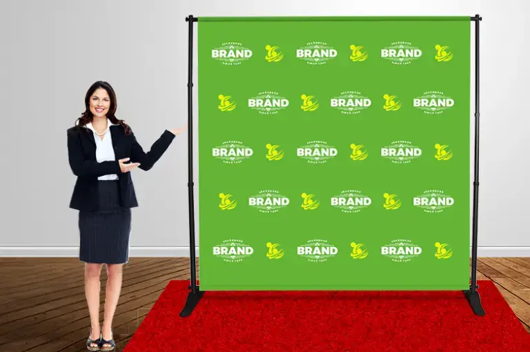
- Green and White: A fresh and modern combination that symbolizes growth and innovation.
- Size Recommendation: 8’x10′ for outdoor events or eco-friendly initiatives.
- Uses: Sophisticated and luxurious, perfect for gala dinners, award ceremonies, or fundraising galas.
- Advantages: Elegance and prestige, symbolizes prosperity and success, enhances brand prestige.
- Design Considerations: Use rich shades of green for depth and sophistication, maintain a balanced composition.
- Purple and Silver: A dynamic and eye-catching combination that creates a playful yet impactful backdrop.
- Size Recommendation: 8’x8′ for intimate gatherings or themed parties.
- Uses: Regal and elegant, suitable for upscale events, charity balls, or cultural celebrations.
- Advantages: Royalty and sophistication, creates a sense of exclusivity, adds a touch of glamour to the event.
- Design Considerations: Incorporate ornate patterns or motifs in silver, use deep shades of purple for richness, ensure readability of text against the background.
- Teal and Coral: A trendy and contemporary pairing that balances depth with brightness.
- Size Recommendation: 10’x8′ for fashion events or product launches.
- Uses: Trendy and vibrant, suitable for summer events, beach parties, or outdoor festivals.
- Advantages: Freshness and vitality, evokes a tropical or coastal vibe, appeals to a younger demographic.
- Design Considerations: Use bright and saturated shades of teal and coral, incorporate beach-themed graphics or motifs, maintain a balanced composition to avoid overwhelming the backdrop.
- Navy Blue and Gray: A calming and sophisticated combination that appeals to a diverse audience.
- Size Recommendation: 8’x10′ for corporate conferences or networking events.
- Uses: Modern and sophisticated, perfect for corporate events, business conferences, or networking functions.
- Advantages: Professionalism and elegance, suitable for a corporate environment, enhances brand credibility.
- Design Considerations: Opt for subtle shades of gray and navy blue, use clean and minimalist graphics, prioritize legibility and clarity in design elements.
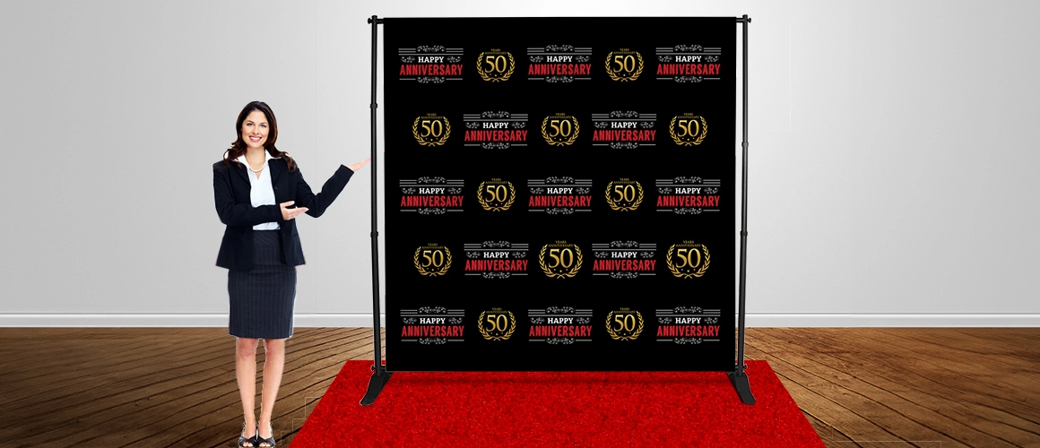
- Burgundy and Gold: A rich and luxurious combination that adds warmth and depth to the backdrop.
- Size Recommendation: 8’x12′ for formal occasions or charity fundraisers.
- Uses: Burgundy and gold exude a sense of richness and luxury, making them perfect for formal events such as galas, awards ceremonies, corporate dinners, and upscale fundraisers. Advantages:
- Applications: Burgundy and gold combination conveys a sense of prestige and sophistication, making it ideal for high-profile gatherings. While inherently luxurious, these colors can be adapted to suit various event themes and styles, from classic and traditional to modern and chic. They complement a wide range of decor elements, allowing for flexibility in event design.
- Design Considerations: Maintain a harmonious balance between burgundy and gold elements, ensuring neither color overwhelms the other. Consider using burgundy as the dominant hue with gold accents for a sophisticated touch. Matte and metallic finishes can add depth and visual interest to the backdrop, while textured fabrics provide tactile appeal.
- Pink and Silver: A chic and feminine combination that radiates glamour and sophistication.
- Size Recommendation: 8’x8′ for bridal showers or women-centric events.
- Uses: Feminine and glamorous, ideal for bridal showers, fashion shows, or charity events targeting women.
- Advantages: Elegance and sophistication, conveys romance and luxury, appeals to a female audience.
- Design Considerations: Use soft shades of pink for a delicate touch, incorporate metallic silver accents for a glamorous effect, include floral or decorative elements for added femininity.
- Orange and Black: A bold and striking pairing that injects energy and excitement into the atmosphere.
- Size Recommendation: 10’x8′ for outdoor festivals or community events
- Uses: Perfect for Halloween parties, themed events, or youth-oriented functions.
- Advantages: High contrast and visibility, evokes energy and excitement, adds a playful touch to the event.
- Design Considerations: Use bold fonts in black against an orange background, incorporate Halloween-themed graphics or motifs, maintain a balanced distribution of colors.
- Indigo and Orange

- Uses: Playful and energetic, ideal for outdoor events, family-friendly functions, or youth-oriented gatherings.
- Advantages: Bright and cheerful, conveys a sense of fun and excitement, appeals to a diverse audience.
- Design Considerations: Use vibrant shades of indigo and tangerine, incorporate playful graphics or illustrations, ensure readability of text elements against the colorful background.
5 Useful Tips for Designing Step and Repeat Banners
When designing step &step repeat banners using these color combinations, consider the following best practices:
- Prioritize Branding: Ensure that logos, sponsor names, or event hashtags are prominently featured and easily visible against the background color combination.
- Maintain Balance: Distribute colors evenly throughout the design to create visual harmony and avoid overwhelming the backdrop.
- Consider Lighting: Test the banner design under different lighting conditions to ensure optimal visibility and readability, especially in photographs.
- Incorporate Graphics: Use decorative elements such as patterns, motifs, or illustrations to enhance the visual appeal of the banner and reinforce the event theme.
- Optimize Legibility: Choose fonts that are clear and easy to read, especially from a distance, and avoid overcrowding the design with excessive text or graphics.
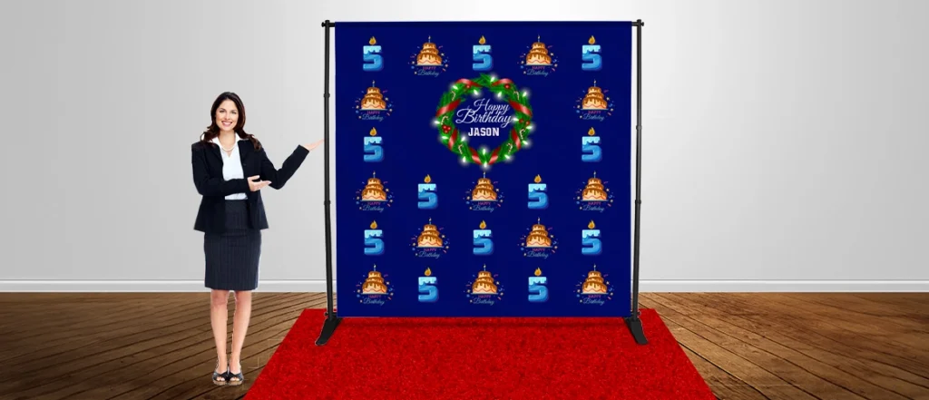
When determining the size of your step and repeat banner, it’s crucial to factor in various considerations such as the venue’s dimensions, the banner’s intended placement, and the expected number of guests. Larger events with significant photo opportunities may necessitate larger banners to accommodate group shots and ensure optimal brand visibility. Conversely, smaller gatherings or more intimate settings might benefit from smaller banner sizes that seamlessly blend into the environment without overwhelming the space.
Ultimately, the selection of color combinations and banner sizes should align with the specific requirements and objectives of each event, as well as the desired aesthetic and branding goals. It’s essential to explore different options, gather feedback from stakeholders, and prioritize factors such as readability and visual impact to create step and repeat banners that truly stand out and make a lasting impression on event attendees
Written by BannerBuzz Editorial Team