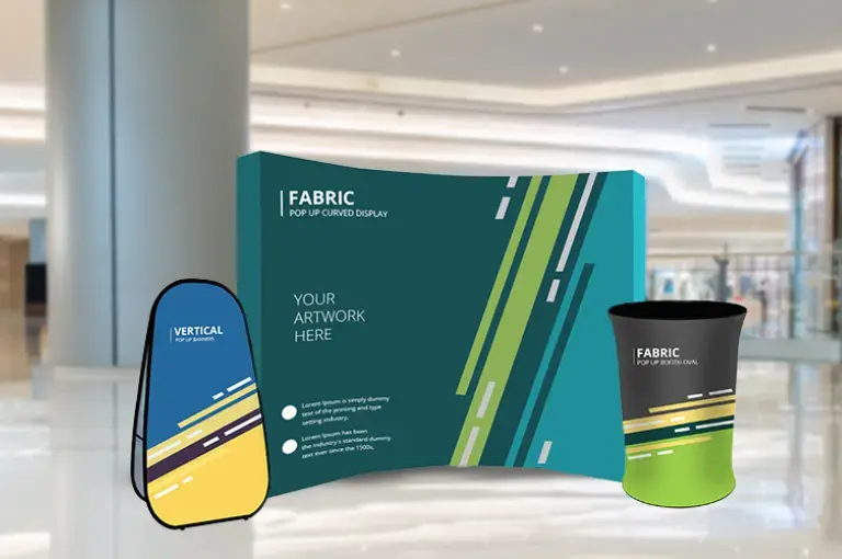


Signage is a powerful advertising tool small companies can use to boost their businesses. Oftentimes, storefront signs and event banners are the first impression passersby have of your company. While print marketing materials are a great way to boost your brand’s awareness, you’ll need to design your signs with a competitive edge to rise above the rest.
The average American sees anywhere between 4,000-10,000 advertisements per day. That means run-of-the-mill, bland design will not cut through the clutter. Expert design tips are needed to give your banners the competitive edge you need to captivate new customers and expand your brand.
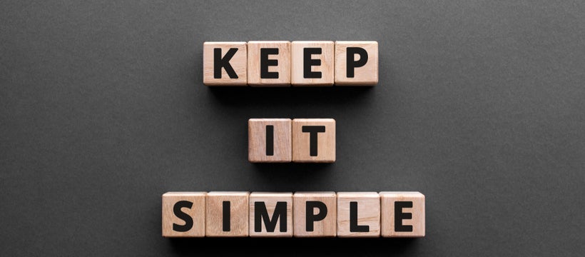
Keep Your Message Simple
According to a study conducted by MSN, your signage has seven seconds to make a first impression on new customers. Eye-catching, clear communication is key to effectively getting your message across. You don’t want your banners to get bogged down with unnecessary details that risk confusing your customers.
As you design your signage, ask yourself, what specific information do you want to share with your customers? Are there specific actions you want passersby to perform? Once you have those answers in mind, make sure every design decision supports your banner’s main purpose.
Signage with a direct call to action makes for the most impactful messaging strategy. Out-of-home advertising drives three times more digital and social activations than any other media type. Therefore, if you want to boost online sales or increase social media engagement, printing an eye-catching call to action on your banner can be a simple yet effective way to drive consumer behavior.
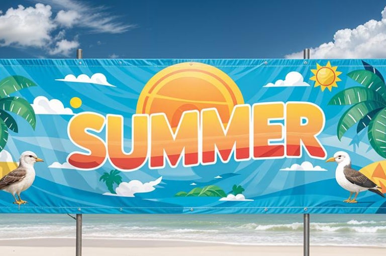
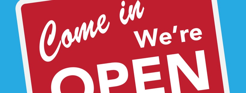
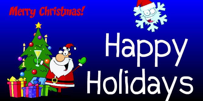
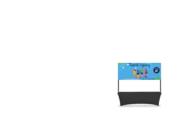
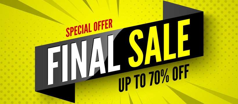
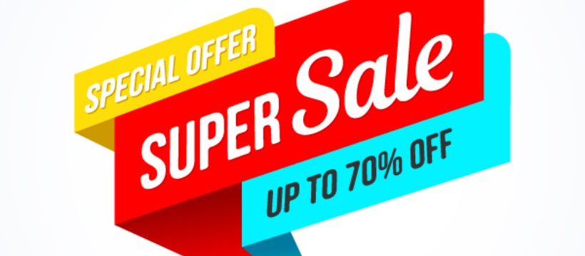
Keep your messaging short and sweet with key information. The rule of thumb for copywriting is that less is better. Make it short, catchy, and actionable. Add a call to action like “Now Open”, “Order Online”, or “Get 50% OFF”.
Focus On Easy-to-Read Fonts
When you design your banners, think about the environments in which customers will interact with them. A well-designed banner is one that can easily be scanned at outdoor events, stand out amongst crowded storefronts, or along busy roadways. The average American drives 26 miles per day, so if your new business signage is near roadways or busy intersections, you want to present them with easy to read information.
A University of Nebraska study revealed that proper font choice can significantly improve information recall. Your potential customers need to remember key information about your business so they can plan their visit; therefore, make it easy for them to remember what’s important.
Make sure information about upcoming sales, grand openings, or special events is legible with bold, sans-serif fonts like Futura and Helvetica. You can use letter casing to highlight important information in all caps or bolden specific words to immediately direct your customer’s eye to the most important details.
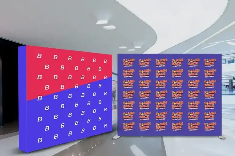
Hierarchy Helps You Get Your Message Across
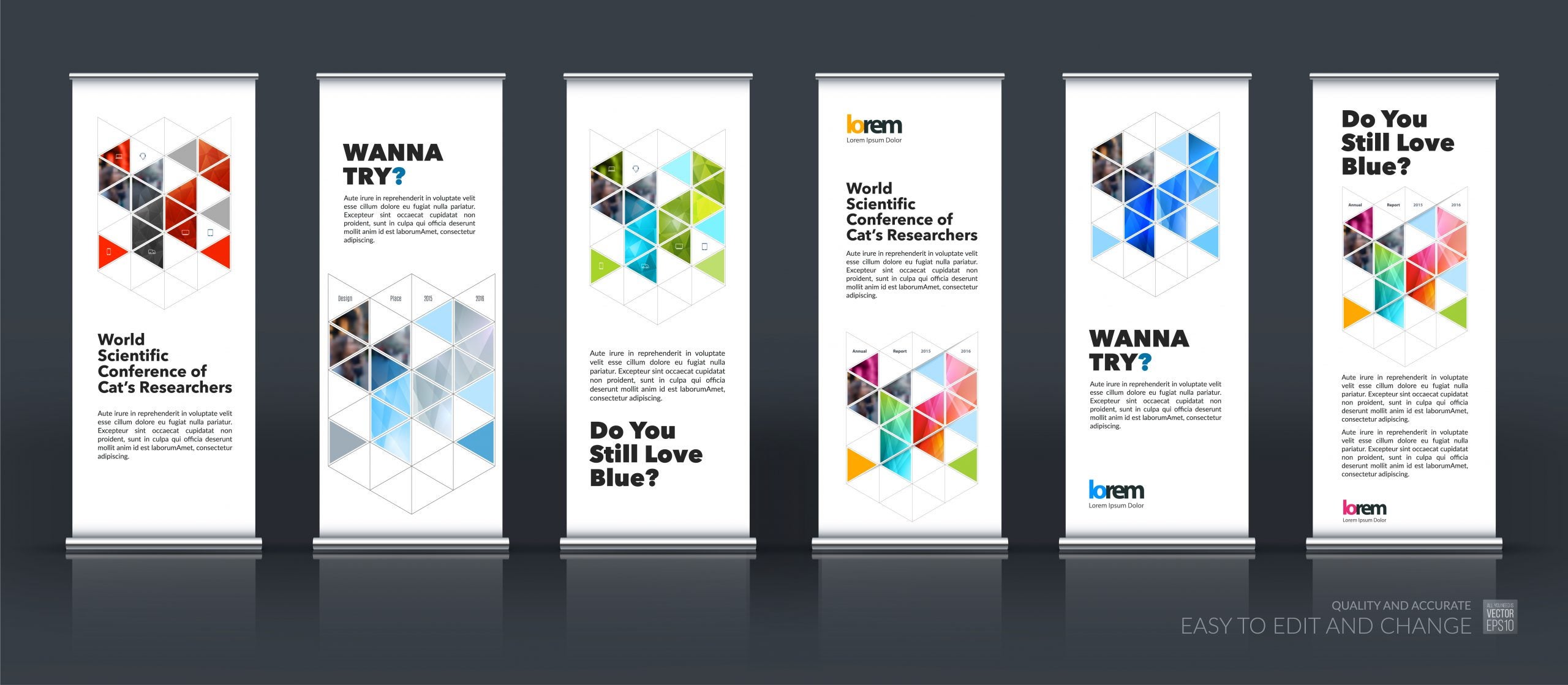
The order in which you arrange design elements on a banner will establish those elements’ level of importance to viewers. Designers often arrange visual objects according to size to direct the viewer’s eye towards the largest and most important pieces of information.
For example, English speakers read from left to right, so you can position text and graphics in the same order so information flows logically, or you could break the typical information flow to pop a specific word or visual element and establish a new focal point.
In addition to visual hierarchy on a specific banner, you can create visual hierarchy with multiple signs for a show-stopping display. According to Mark Pearlman, design director at Alameda, your most pertinent information needs to be scannable at 50-100 feet away for tradeshows and large scale events. Logos, company name, and taglines are typically featured here because they are quickly identifiable elements that direct readers to your booth or store.
Next, position secondary signage 10-50 feet away and give potential customers some more details about your sale or event. These elements can include text explaining the promotion or photos that showcase what you sell. Lastly, tertiary signage should be scannable from 1-10 feet away and present information to those customers who are ready to connect with your company right now. Product details, demonstrations, and promotional decals work well in this space to grab your patron’s attention inside your store or at the event space.
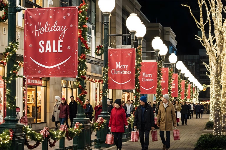
Color Contrast Is Key
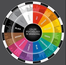
Research has shown that people can decide how they feel about a product within 90 seconds. Not surprisingly, 90% of that initial judgement is based on color choice, and proper color choice can boost your brand awareness by 80%. The red Target bullseye against a white backdrop and McDonald’s classic golden arches are prime examples of effective color choices driving brand recognition and growth.
You, too, can work with a designer to develop a brand-appropriate color palette to evoke particular emotions you want associated with your company. Red, for example, is a warm color often used to evoke strong feelings of passion while yellow is bright and cheery and blue can create a sense of tranquility.
Your brand’s style and logo should determine how you implement color choice in your banner design. If you own a spa, blues, greens, and purples can elevate a sense of calm and serenity while repair services may opt for eye-popping colors like yellow or red to get their customer’s attention. Whatever direction you take your color choice, consistency is key. Your banner colors should make your brand easily identifiable and hues should be easy to read.
Once you decide on a color palette, implement high contrast colors to ensure your signage is scannable. Balancing black and white or light and dark fonts with contrasting backdrops makes the information easier for your customers to perceive and increases customer responsiveness by 23%.
Use Shapes and Lines to Define Your Design
Given that nearly 90% of the information transmitted to the brain is visual, it’s clear to see why shapes and lines play an important role in banner design. Research shows that the human brain processes images about 60,000 times faster than text, so you should employ visual elements to streamline messaging whenever possible!
You can print important information within certain shapes to highlight calls to action and pressing details. Additionally, you can use lines to direct a customer’s eyes to the next steps they should take to find your location. Use shapes and lines to simplify your banner’s message and replace unnecessary text whenever possible.
Making a memorable impression on new customers is no small task, but great design really does make a difference. Bring these five expert design elements into your next custom banner design and you will definitely leave a lasting impression that outshines the competition.
References
You And Your Business Have 7 Seconds to Make A First Impression: Here’s How to Succeed
Forbes
Nielsen: OOH Most Effective in Driving Online Activity
OAAA
https://specialreports.oaaa.org/wp-content/uploads/2017/05/Nielsen_042417.pdf
Daily miles of travel per driver in the United States between 2001 and 2017
Statista
https://www.statista.com/statistics/1007157/us-daily-miles-per-driver/
Understanding the Effect of Font Type on Reading Comprehension/Memory under TimeConstraints
University of Nebraska
Five Steps to Successful Signage
Exhibitor
https://www.exhibitoronline.com/topics/article.asp?ID=867
Colour Increases Brand Recognition By 80%, But How Many Brands Can You Recognise?
Impact of color on marketing
Emerald Insight
https://www.emerald.com/insight/content/doi/10.1108/00251740610673332/full/html
5 Retail Signage Tips to Drive Attention and Traffic to Your Store
Vend
https://www.vendhq.com/blog/retail-signage/
Humans Process Visual Data Better
Thermopylae