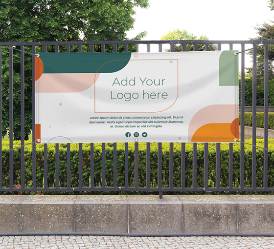
Signs and banners are easily some of the most important tools in your marketing efforts, these simple outdoor solutions can increase your foot traffic and lead to more sales. If you apply these steadfast rules you’ll be on your way to designing greatness.
Keep It Super Simple

The aforementioned title alludes to the acronym K.I.S.S, which is one principle great writers use when approaching brand messaging. Copy should be concise, succinct, and communicate precisely what you’re aiming to accomplish.
The Truth in Advertising
A Boomerang study conducted in 2016 found that emails written at a third-grade level received a 36% lift in response rate. The old adage of distilling information down to something that even a 5 year-old (or in this case 8-year-old) could understand rings true. Not for lack of intelligence of the consumers, rather it’s a lack of attention and focus in the modern digital world.
A Microsoft Attention Span study in 2000 found that the human attention span is 12 seconds; when they repeated the study fifteen years later the average attention span dropped to 8 seconds. While the change cannot be directly attributed to the advent of digital marketing and an overload of visual information, the point is clear: time is extremely limited when it comes to your consumers attention.
Definition to Stand Out
You’ll need to consider the distance between your sign and the consumers, the location of your sign, and how it will be viewed. If you’re trying to get a passerby to stop and stare at a sign, it needs to be unique, something interesting and different from the usual white noise. Asking someone on the go to stop is a challenge, so you should make the messaging big enough to be seen from a distance. Even if they don’t stop, if it piques their interest they will compartmentalize it for later.
How to Follow the Numbers
In an Edelman 2019 brand study, they found 63% of consumers say that how a brand stands out from its competitors influences their decisions. They also cited interesting designs and unique looking products helped inform their decisions.
Colorcom found that color leads to a 42% increase in readability. Furthermore they found that black and white images hold interest for two-thirds of a second; inversely, colored images hold attention for two seconds or more.
I think we’re starting to see the picture…
Turning Negative Into Positive
Although it seems counterintuitive, utilizing negative space can guide the eye towards your messaging. Instead of cramming copy and visual data into your marketing, try a refined technique that relies on using negative space. When designed well, an outdoor advertisement effectively utilizing negative space will see its message pop more regardless of its surroundings.
The Right Typeface
Choosing a great font can add another layer of depth & memorability to your branding efforts; whereas, a font choice that is illegible will lead to your hard work not being read. Whatever you choose has to be something that is read very quickly and creates a lasting impression. If used correctly a font can draw more attention to your signs and banners.
It’s worth noting that certain fonts work better in different applications. For instance, sans serif looks better on a digital screen, so more brands are changing to accommodate that.
Finding the right font can be determined by where your marketing message will be placed. As a general rule, fonts can be placed into two categories:
- Sans Serif are classified as modern, playful, approachable, and used for cutting edge companies. A few Sans Serif fonts are Arial, Helvetica, Proxima Nova, Futura, Calibri, even Comic Sans.
- Serif fonts are classified as minimalistic, simple, traditional and in some cases more legible than Sans Serif fonts. Some examples of Serif fonts are Times New Roman, Garamond, Baskerville, Georgia, and Courier New.
Color Me Impressed
A University of Maryland study found that blue is the most liked color by both men and women (42% for men and 29% for women). That research may be the reason that 33% of the top brands use blue in their logos.
Knowing that blue is popular among consumers is great, but knowing how to use different colors for different reactions is more helpful. For instance, the reason red is used in big sale banners is almost primal. The color red is ingrained in human psychology. Red catches the eye and signals excitement, danger, and energy on a psychological level.
A slight difference in your color wheel choices can lead to an extra pop and evoke various emotional responses. In your outdoor banners this simple choice should be a calculated decision.
Resources
Why Color Matters
Colorcom
https://www.colorcom.com/research/why-color-matters
7 Tips for Getting More Responses with Your Emails
Boomerang
https://blog.boomerangapp.com/2016/02/7-tips-for-getting-more-responses-to-your-emails-with-data/
2019 Edelman Trust Barometer Special Report
Edelman
Pie Chart: Humanity’s Favorite Colors
LiveScience
https://www.livescience.com/34105-favorite-colors.html
Visions for 2020: Key trends shaping the digital marketing landscape
Oracle Data Cloud Blog
https://blogs.oracle.com/oracledatacloud/2020-trends-shaping-the-digital-marketing-landscape

 Posted in