Of course! In a world full of look and feel, we do think of a numerous ways to market our signs and get them noticed. But have we ever thought of the aesthetics on the banner? Have you ever thought of why Apple products stand out loud from the rest of the market? Placing the right kind of words and using the correct effects will definitely help emphasize on the necessary words with effective communicating your message across. Something to keep in mind while designing your banners is its application, whether indoor or outdoor. That is, whether the sign needs to be readable from a far off distance or a closer proximity. Your design factors would change based on their readability factor.
Let me give you the seven thumb rules to improve on your banner design and give it a fine aesthetic touch and get noticed amongst your customers:
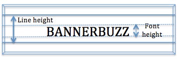
- Font size and line height: Often neglected, font selection is one of the most important factors while designing your banner. So is the line height. Both are directly proportional in nature. Once increases the other must increase to maintain geometric proportion.
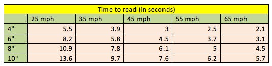
 Readability being one of the key focus point of font size, here is the chart that displays the average time it takes for a person in motion to read your banner and the distance to font size chart:
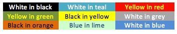
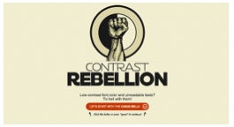
- Font color and background contrast: The color contrast again plays a key role in the visibility of the font. Pay close attention to the backdrop and its color; choose the color of the font wisely with its respect. Some of the widely used contrast colors are as follows though the most elegant being black in white:
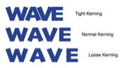
- Space between characters: The letters should never appear cramped or that impairs the readability and reduces the effectiveness. Also known as kerning less commonly as mortising.
- Empty space in your banner: It is definitely ok to leave blank spaces in your banner and let it breathe. Design your banner in a way where you can see the backdrop and the empty space. This increases the contrast with font and enhances readability. You can use the 60/40 rule for the empty space where use the banner space up to 60% and leave the rest 40% across the banner vacant.
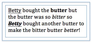
- Use of Bold character effect: The effects should always be used very wisely to make sure you don’t weigh on the wrong word or all the words. Bold is used to emphasize on particular words and creating contrast from the skim texts. Key is to never overuse this effect.
- Use of Italics effect: Titles, names, reproduced sounds or foreign words can be italicized but one should refrain from overusing the effect.
- Use of Underline effect: Clarifying an unfamiliar word, reference letters, numerals in the text and names, underlining is definitely an effect that draws attention. Keep in mind while using any of these effects that never ever to use all the 3 together or even any 2 in this matter.
By tactfully designing a banner keeping all these points into consideration, one can effectively communicate a point across the table. After all perceptibility with prominence is your end goal!
Happy designing 🙂

 Posted in